Friday, 3 December 2010

I'VE FOUND MY STYLE! HORRAY!

I've always lacked a "style" and consistency in my work. I've always been aware of artists and illustrators that have a distinct style, so much so that if you look at a piece you will immediately know it's by that artist. I've always wanted my work to be like that and now I think it will happen!


The current brief for my university project is a live competition brief set by D&AD. The competition is to illustrate to a piece of music...


For this project I started looking at circus music, because I've always like the creepiness of the calliope and the old fairground organs on the gallopers. As I was typing "Circus music" into Spotify, I discovered a band called The Tiger Lillies who had released an album called Circus Songs. Out of curiosity I click play expecting to hear something completely shit....but what a find! They sum up every emotion I get from old circus and freak show culture! 


Their genre is often described as "dark cabaret" which I find very intriguing! They have a really eerie sound to the vocals, which is backed by mostly only an accordion, double bass and soft drums. They sing about all sorts of twisted things - aids, prostitutes, death... They take these subjects - the horrors of life - an sing about them in this style that in a weird way is quite comical yet macabre.


Anyway, the song I chose in the end was a song of theirs called "Pretty Lisa"....


"In the fairground, Pretty Lisa's selling candy by the bar
Pretty Lisa's training hard to be a high wire star


Lisa's life is just a journey on the roundabout
Everything is very pretty until the ride runs out


Dashing Tony is her trainer
He's got straight white teeth
Lisa thinks that he's an angel
He's a pimp, and he's a thief


Well life is just a ride upon a roundabout
But pretty soon that ride it will run out


Tony has his Pretty Lisa tattooed from head to toe
Now he's sitting in a booth with her in the freak show
Tony hits his Pretty Lisa, but everything is fine...


The tattoos they hide the bruises every time."


This absolutely screamed at me and I was instantly inspired! For research, I looked at old circus costumes, posters, makeup, freak show acts, fair organs, toys and any sort of circus memorabilia I could find. Artist-wise, I looked at Tim Burton's Corpse Bride, Coraline, Edward Gorey (these are the sorts of artists I was on about being consistent in style earlier!)


I've always been better at using digital media such as photoshop, but I was never with the style I produced when using it. It was really 2D and looked more graphicsy. I love seeing textures in others' work, and the feeling that you just want to reach out and touch it. I really want to start using more textures in my work.


I started experimenting with digital collage...I modified an ordinary barbie doll and turned it into something completely different. I photographed her, scanned in fabrics and textural papers and started collaging them all together on photoshop..


After a bit of developing compositions etc, I produced the first page for my storybook about Pretty Lisa....


I'm so happy with this style that seems to have descended upon me from the gods out of the blue! I'm really enjoying every moment of this process, even the sitting in front of a computer screen for hours at a time! It's so much more exciting to look around for different textures and patterns rather than using solid colours. I also feel like I'm putting more soul into the image and giving it more depth - a flat image has no emotion or feeling and it rubbed off on me and made me hate my old stuff!


I'm continuing with this book...will post again when it's finished!! ^_____^


Thursday, 11 November 2010

Illustration for an Environment - Non Commercial Brief Part 3 - FINISHED YAY.


This is a digital collage of my final design for a jazz mural! I'm really happy with it, though it will look much better painted. Being a digital collage some parts look a bit messed up.. I'm planning to make a large, painted mock up out of wood so I can paint it instead..


Using my amazing photoshop skills, I super imposed my design onto the original location I found at the start of my project. Unfortunately this location in Leeds looks like it's being rebuilt or knocked down or whatever with scaffholding everywhere at the moment!

Illustration for an Environment - Non Commercial Brief Part 2 - JAZZ!


After a slap 'round the face at a tutorial, I got my groove on and started making some mess with paint, ink and love!


I went to see a gypsy jazz band at La Bastille, a french restaurant, as part of my research for this project and just sat there making primary sketches and taking photographs and drinking wine.


I took the rough sketches I'd made here and blew them up to A2..and I wanted to experiment using sponge brushes and here's the result...


and interesting effect but I don't think it fits right with what I have in mind...


I then tried using masking tape to make an outline..


I then painted over it in ink..the masking tape obviously resisted the ink and when it was dry, I peeled it all off to reveal this illustration...


I like this, he looks very content with his accordian! However it is quite time consuming and would probably look naff on a large scale!


Therefore, I've decided to stick with paint as it's the easiest media to use when painting a mural..


I started developing each figure for my mural.


I took inspiration from classic jazz divas such as Nina Simone, Ella Fitzgerald and Billie Holiday, to come up with this final idea.


I felt that giving her a blue skintone would make the image a little more sophisticated, and gave her a costume that made her look slender and elegant.

 I feel like I am more drawn towards the fine art approach in my illustration. I still enjoy messing about with media and I'm getting into working really big! Which is a total change from what I used to do when I worked on the computer a lot. It is more enjoyable this way

Wednesday, 27 October 2010

Illustration for an Environment - Non Commercial Brief (and ramblings of an idiotic student)

 Thought it was about time I uploaded some of my own stuff!

For this project, I chose the non commercial brief. This meant going out and finding my own private or public space and creating a large illustration or mural for that space. After debating which sort of area to go for, I chose to look at train stations. This idea didn't last long as all the stations I went to depressed me.


Then as I was just about to leave Leeds, I clocked my eyes on a cafe building underneath an old railway bridge (above). I finally settled on this space because I really love the arched panels and thought it would be really nice to create images within each of them.

Whilst researching a theme of "transitions" I came across the most adorable animation. It is actually really shit but the concept is inspiring and the old man narrator has a nice voice.
The animation is called "The Unsettling Truth About Life" (YOUTUBE IT!)

Basically it compares life to a piece of music and the moral is we should sing/dance along and enjoy it.

Then my tutor told me to: "draw what you like drawing!"

Well I like drawing people, and I like jazz. I therefore decided to try and compare music to jazz visually. Also I thought this sort of jazz/underground theme would look really good in my railway arches.

After experimenting..or rather dossing about in my sketchbook, I came up with this final idea below..


I was really happy with my little jazz man and was in the process of pulling other things together with it; jazz singer, a sax and drum player as well as abstract backgrounds and text.
However in a one to one tutorial, my soul was crushed as my tutor didn't like it. Apparently it isn't sophisticated enough and he wanted to see more hand drawn qualities as well as detail. Although at first I was devastated, I can see where he is coming from and I have always thought my digital work was too flat and lifeless.

Also my sketchbook stuff is lacking in resources..

So I am now in the process of going back over everything and it sort of feels like I'm back at square one. I have done a few larger paintings today in my sketchbook (below) ..they aren't realistic, that's not my thing! But I am quite proud of them and beginning to develop them and work something out. 

I used acrylic paints for these and slapped it on so no one can tell me off for them being lifeless!


Selfridges Christmas Displays 2010


Gotta love them Selfridges displays!

Street Art Exhibition - Herbert Art Gallery & Museum, Coventry


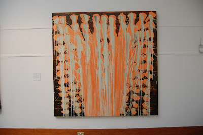
Today I went to the Herbert Art Gallery & Museum in Coventry to see the Street Art Exhibition...Not knowing much about street art other than the obvious, I was expecting it to just be graffiti and stuff but it was actually really interesting and some things I was totally not expecting, such as the work above. Was meant to be no photography but I manages to get a sneaky few on my phone before the lady told me off. The first image above is a section of Sarah McLaughlin's work which I was introduced to just the other week when I saw her paintings on the Central Library building in Birmingham. I think I am in love with her work!

Walking out of the gallery I went past the old cathedral that was apparently burnt down! I loved it, its like a shell...


Tuesday, 19 October 2010

Harvey Nichols Window Display in Leeds


I visited Leeds last week and walked past this amazing window display in Harvey Nichols! I absolutely loved it! So imaginative! ^-^

Birmingham Art Gallery and Museum


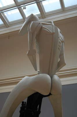
Wandered about a Birmingham Museum a few weeks ago. Saw a few cool bits and bobs...hehe bum!

Street Illustration in Birmingham


Saw these cool illustrations on the central library building in Birmingham and thought they were quite cool! It is this form of work I have chosen for my first project of second year at BCU - Illustration for an Enviroment.

Thursday, 7 October 2010

IKON Gallery - Kitagaw Utamaro Exhibition


Today I went to the Kitagawa Utamaro exhibition at the IKON Gallery in Birmingham. The exhibition featured loads of original japanese prints. It was really amazing to see the detail of the prints close up, and crazy how they could achieve such detail through woodblock prints! The show also featured some of the erotic prints too which was quite a sight! ;D

Wednesday, 6 October 2010

Marita Forss - Exhibition at Leamington Spa


On Monday I went to the private view of Marita Forss' work at Leamington Spa. There was stuff in different media, my favourite though were the small illustrations (above). A lot of the large paintings and mixed media pieces she does are good, they show a dream-like state and it's all very conceptual. Although I preferred the illustrations, she seems to have a good knowledge of what certain media can do and she uses it really well; for example in her use in acryllics is not heavily applied but really thin and she blends the colours really well.

Thursday, 23 September 2010

Summer Project - Drinking In Britain


For my summer project entitled "Drinking in Britain". After realising there were so manyangles to take in this project, I felt more drawn towards illustrating the effects of alcohol. I researched the long term and short term effects and this is what I came up with.

I created a life size piece which pictures a man drinking alcohol. I took some inspiration from those medical/educational diagrams you find in those school science text books, and also from an incredible illustrator/typographer called Oscar Wilson (check him out).

I created the dark background by photcopying newspaper articles that show the negative side of alcohol and collaging them together, working over them with paint, charcoal and oil pastel to give it some texture and atmosphere. The figure is made of brown paper and each part of the body is done using black marker pen on red painted paper and stuck over the top.

The illustration itself shows the effects of alcohol, and highlights all the body parts and vital organs that are effected when large ammounts are consumed. Such problems such as liver damage, heart disease and mental health problems are illustrated here.

Originally I intended this to be used as some sort of educational campaign against binge drinking but scaled down and photoshop filtered, it could still look good as a magazine or newspaper illustration as I have demonstrated in the last picture. 

Visit to V&A - Grace Kelly:Style Icon


Some (fairly poor quality) photographs I took at the Grace Kelly exhibition in London. I love everything to do with old Hollywood glamour and watching old movies so this exhibition was a must for me. I really loved it; the exhibition featured Grace Kelly's costumes from movies such as High Society to Alfred Hitchcock's Rear Window. 

There were also a lot of her personal wardrobe on display, such as an Yves Saint Laurent "Mondrian" dress and a gorgeous purple evening gown by my favourite designer of all time, Givenchy. The last two photos are of the gown she wore to accept her Oscar award for "The Country Girl" in 1955, along with the actual award itself, and the stunning wedding dress she wore when she became Princess Grace of Monaco.

The only bad feeling about this was the fact that next to each dress there was a photograph of Grace Kelly wearing it, and she looked obviously looked more stunning wearing them than the mannequins did!

"A Tissue!" - Design for Kleenex Competition


My design for a competition to design the box for Kleenex Tissues. This was done using Photoshop.

Personal Work - Masquerade Carnival Series


A recent series of personal illustrations. These were inspired by vintage circuses, masquerade costume, and victorian side shows.

These pieces are on display at the Room52 Giles Art Gallery in Boston, Lincolnshire, where I will have my very first exhibition on the November 1st - November 15th 2010. These pieces are also for sale so if anyone wants one, get in touch.

You can see all of my digital illustrations here:
www.50sdoll.deviantart.com
http://www.facebook.com/pages/Chloe-Chapman/117868541898?ref=ts

If there are any prints you wish to purchase let me know.

Mother's Day Card


A card I designed for my mum for Mother's day. This is a digital collage using Photoshop.

Valentines Card


I hated all the cards in the shops so I made my own. My boyfriend is obsessed with Muse, so I made a card using the lyrics from our favourite Muse songs. The only bad part is I think he didn't know which way to read it!